Branding
Creating new and exciting brands is proven to be no small task. I was trusted to help create the identities and bring life to these new and exciting local brands.
The details of how these brands came to life are below and show how I am able to take an idea and give it a story.
Sevida
Sevida is a data management platform powered by Leapmetrics. A startup that empowers healthcare organizations to build a trusting relationship with their members by leveraging it’s platform. Their goal is to leverage technology and place information in the hands of healthcare organizations to curate experiences that establish trust with their consumers.
Challenged to find their voice within their competitive set, we designed a visual identity for the platform.
Testing a variety of marks partially inspired by Leapmetric’s current motifs – we sought a visual representation of data points connecting patients to healers. Connecting the dots from point-to-point and bringing together two halves of a whole.
With further insight from the team, we discovered that every patient has their own specific health journey. A journey that often resembles a mosaic of pieces that only fit in one particular way. There can only be a clear defined path where the best care can be provided when all of the pieces are present and fit perfectly. Sevida takes a chaotic system and provides a clear path for the patient.
Taking an analytics-first approach to data management to accelerate and inform healthcare providers’ treatment plans with whole-person data, providing suggestive analytics to improve patient outcomes. Clinicians and healers care enough to know. With Sevida, they know enough to care. Sevida proudly offers advanced technology to provide Informed Care™.
Applied Basics
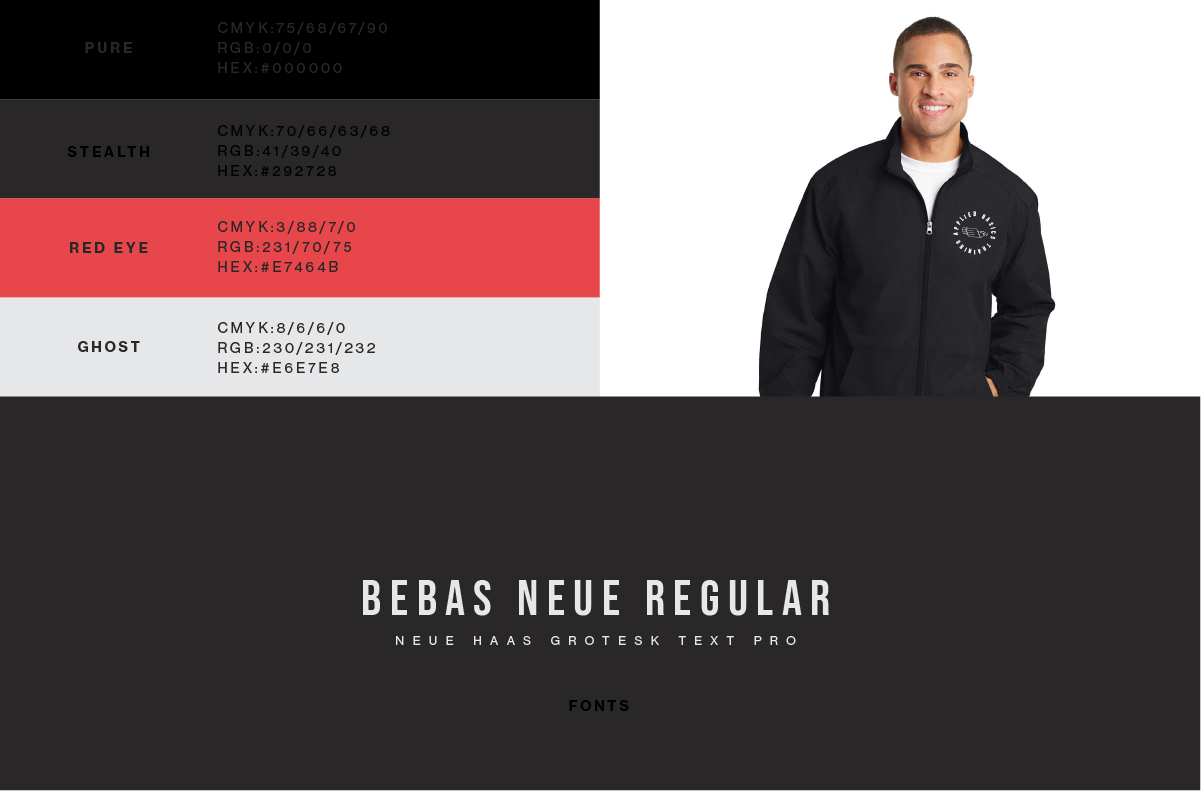
A training-focused self-defense educator was preparing to launch a new brand into the industry. But first, needed a logo and branding that would set themselves ahead within the competitive market.
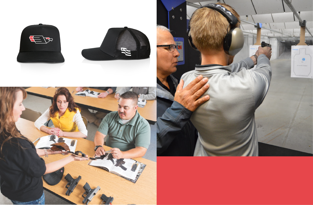
As a veteran owned business, the small team behind Applied Basics Defense saw a need for self-defense trainging program including firearms training for beginners and experiences carriers to personal security professionals and even medical training.
Wanting to attract a wide range of trainees, the brand needed to feel approachable to the novice who is eager to learn while also patriotic to the military personal seeking advances training certifications.
Straying away from the typical shield dawning a handgun or skulls, the single modern eagle represents Independence, Strength, and Freedom.
Refinished Woodworks
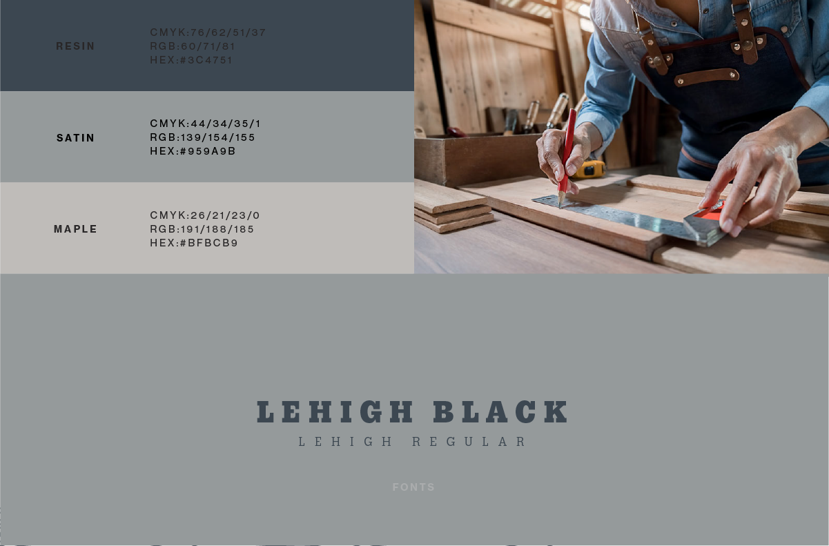
As a one man show – Refinished Woodworks was developed from a concept of rehabbing old out of date furniture and cabinetry.
Giving new life to tired but classic furnishings continues the story for another generation. More than just an elegant piece of furniture but a story to be passed on to another chapter.
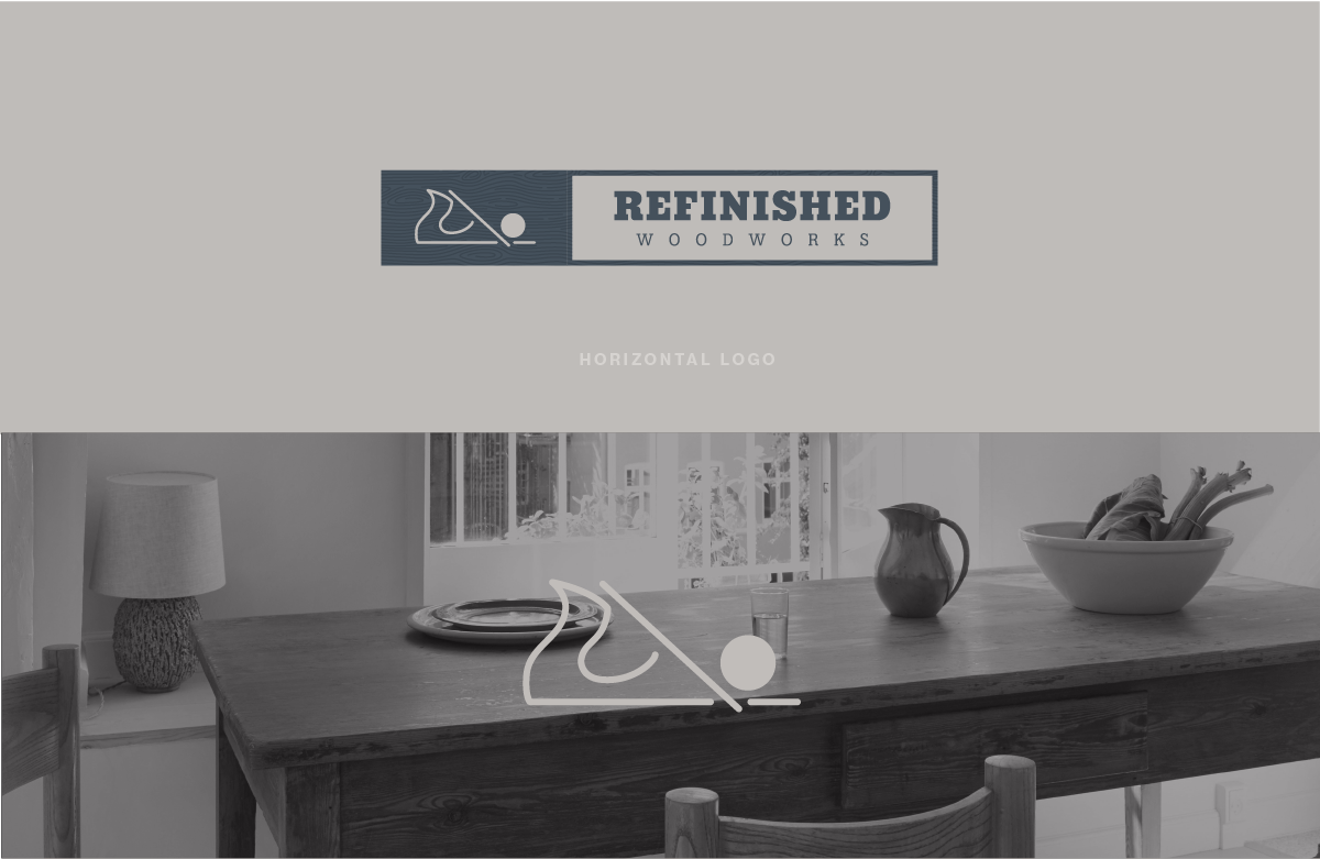
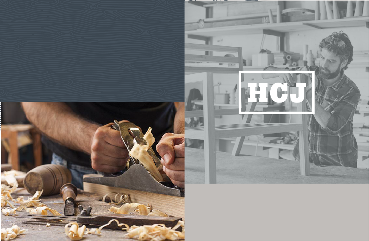
Running the business simply by word of mouth and social presence, the brand needed a mark that represented the hand crafted hard work that is poured into each and every piece.
The “brand” quite literally leave its mark and lives on each piece when completed.
Mech Paintball
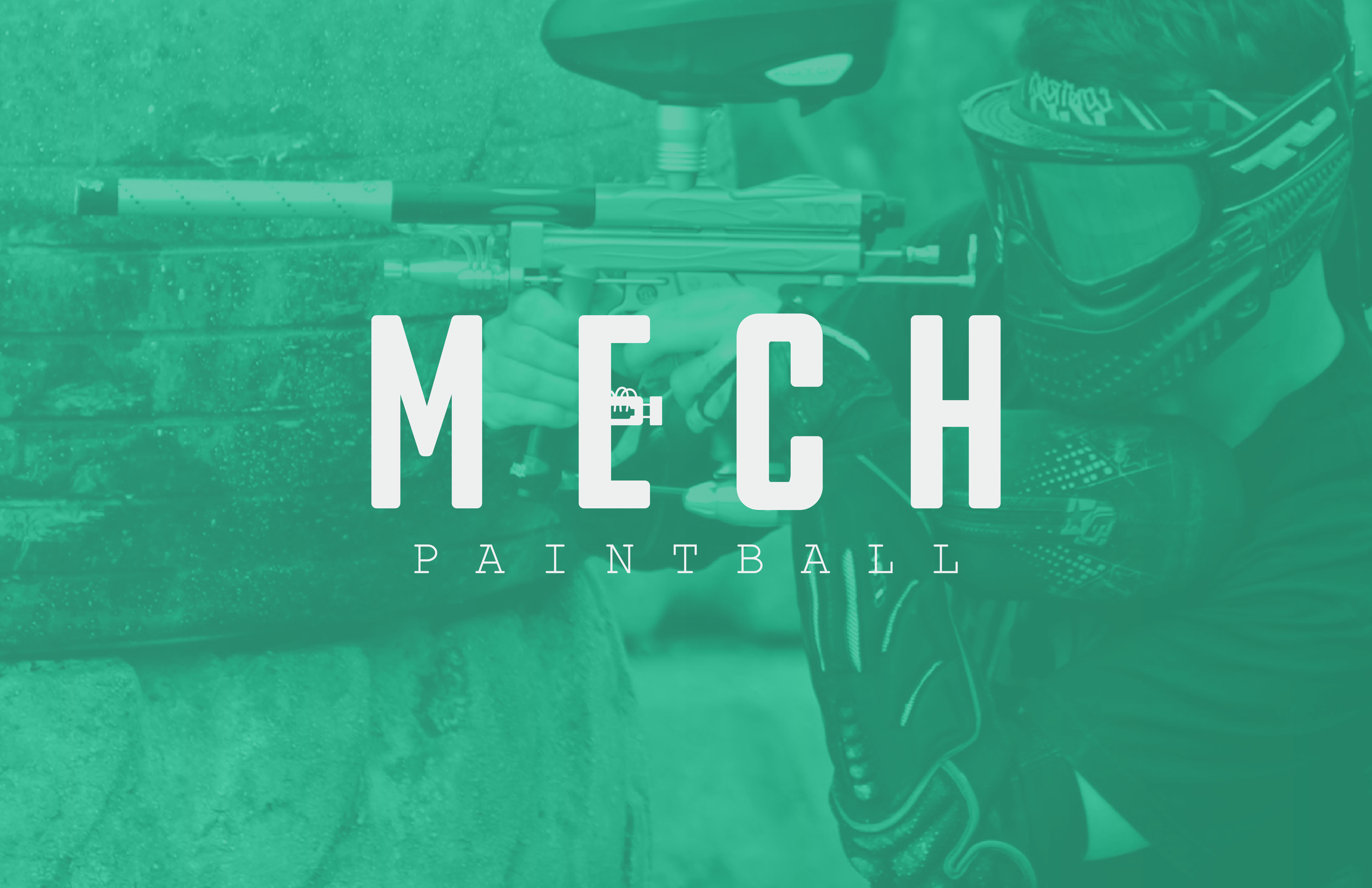
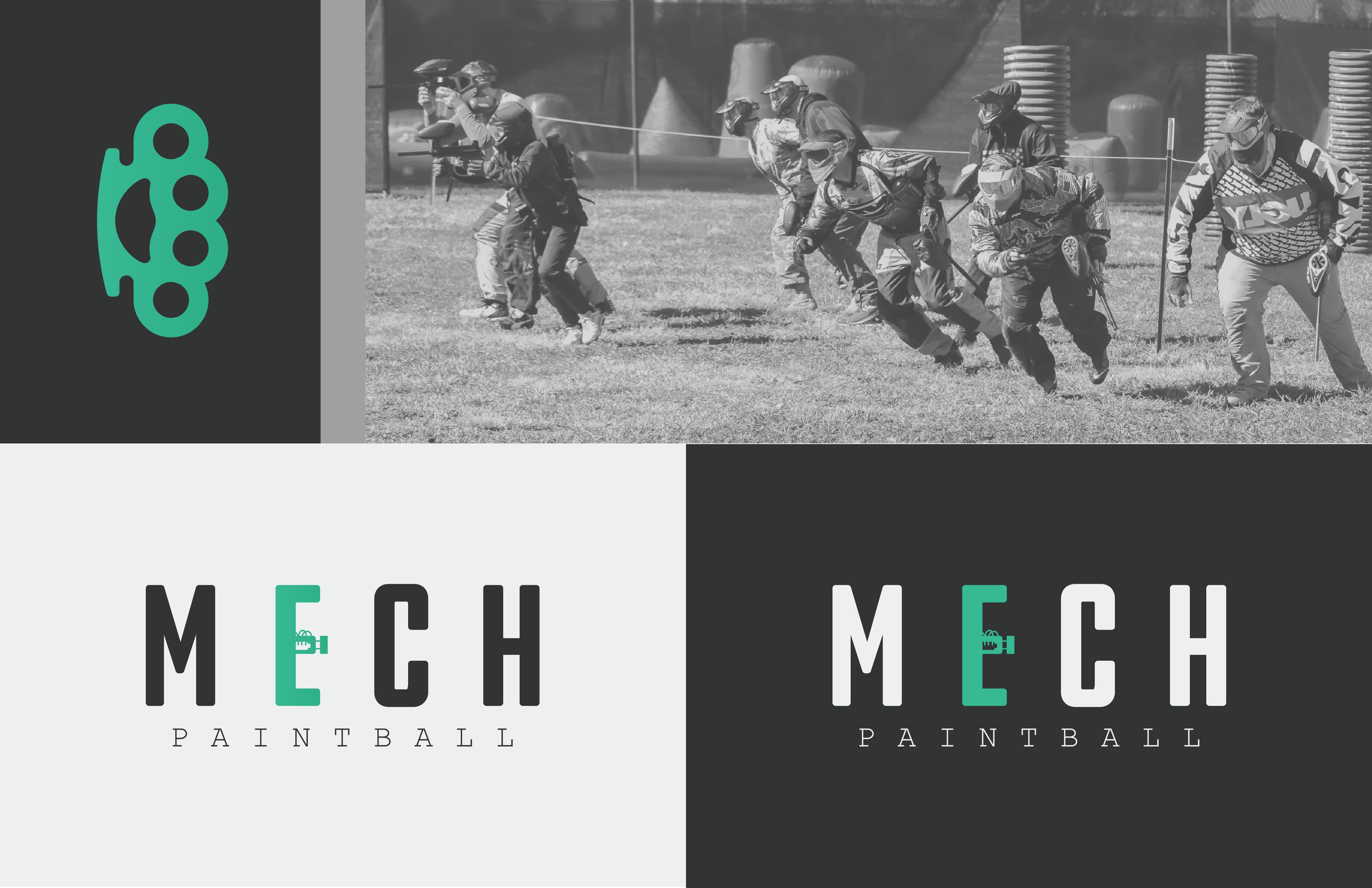
A modern take on a tough as nails classic design. Mechanical paintball guns are back and only a few know what it takes to get back onto the field.
Using the features of these iconic designs from the 90s – the logo took inspiration from the airlines that have since been replaced by modern electronics.

